- Posted on
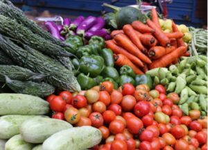
Image via Pexels
The charm of homegrown food isn’t just in its flavor. It’s in how it looks when someone first lays eyes on it — whether that’s a customer at a pop-up or a neighbor unwrapping a basket of backyard abundance. For hobby farmers, especially those bridging the line between casual sharing and small-scale selling, presentation can carry the same weight as taste. And the good news? You don’t need a commercial kitchen, studio lighting, or expensive gear. You just need a rhythm: how you treat, display, and photograph what you’ve grown so it tells the right story the moment someone sees it.
Start with the Plate, Not the Label
Studies on food perception have found that more attractive arrangements on plates influence not just aesthetic judgment, but flavor enjoyment. That doesn’t mean overdecorating — it means being deliberate. Stagger texture and color. Create visual flow. A smear of jam beside a wedge of scone can make the whole offering feel curated instead of casual. People don’t always know why something feels “right,” but they remember that it did. In a world of fast scrolls and short attention, the plate is your elevator pitch.
Polish Your Images, Not Just Your Product
Photos sell — even when you’re not selling. And one of the fastest ways to improve them is to remove visual clutter. That’s why using an easy to use background maker can shift your presentation from casual to professional. Clean white or neutral backgrounds let the food speak. No fridge in the corner. No wrinkled cloth under the jam jars. It’s not about being sterile — it’s about focus. And when you’re making cards, posters, or web listings, those tiny edits compound. The eye trusts clarity.
Let the Container Do the Talking
There’s a moment — before a lid is opened or a slice is tasted — where the packaging alone carries all the meaning. And if your goal is to turn your harvest into a product, then brand impression at first touch becomes the unspoken handshake. A jar with a clean, tightly wrapped label and a textured lid says “I care about this.” The same contents in a repurposed salsa jar say something else. You don’t need perfection — just coherence. Let the outside hint at the thought you’ve already put into the inside.
Eco-Forward Materials Say More Than You Think
For shoppers or recipients who care about waste, your material choices aren’t invisible. Using compostable or recyclable containers isn’t just about ethics — it’s a style move. Cellulose wraps, recycled twine, or pulp cartons give texture and depth without gloss. They communicate that you’re thinking about the lifecycle, not just the shelf life. And for gifters especially, it creates a loop: thoughtful gift, thoughtful impact. You’re not just offering food — you’re showing values.
Use Breathing Room as a Visual Tool
Professional chefs rely on clean negative space around items to guide the eye — and you should too. Cramming every inch of a gift box or photo frame with goodies might feel generous, but it muddies the story. Leave a corner of the cutting board bare. Let that vibrant beet sit slightly off-center with nothing but a scattering of salt nearby. The emptiness isn’t empty. It helps define what matters. That space becomes your silence — the visual pause that makes everything else easier to see.
Preserve Freshness with This Simple Step
Before any of that, though, there’s the matter of keeping your food looking vibrant — days or weeks after harvest. That starts with one easy move: stopping enzyme activity with blanching. A brief dip in boiling water followed by an ice bath can lock in color and texture, especially for fragile items like beans, peas, or greens. It’s not fancy. It’s just effective. That moment of treatment makes the difference between limp and crisp, dull and vivid. Especially when someone else opens the jar, you want what’s inside to look like it just came off the vine.
Make Texture the Hero of the Frame
Pairing smooth and rough, soft and crispy, matte and glossy — these little choices give photos and displays a tactile quality. You’re not just arranging food, you’re hinting at how it feels to eat. The key is texture contrast in food styling, which creates visual friction that draws attention. Think: honey-drizzled cornbread next to fresh herbs, or roasted carrots on a crinkled parchment square. Don’t worry about symmetry. Worry about the story. Good food styling doesn’t just show the product. It evokes the experience of biting into it.
Your harvest is more than food. It’s an experience waiting to be seen, held, and remembered. With a few tweaks to how you treat and present it, you transform it into something that invites attention and earns appreciation. The difference isn’t always dramatic. Sometimes it’s the inch of white space, the gleam on a sliced beet, or the angle of a photo that makes your offering go from overlooked to unforgettable. So gift generously, sell proudly, and know this: how you present your food tells people how to value it.
Discover the bounty of Tuolumne County and support local agriculture by visiting Farms of Tuolumne County for events, news, and opportunities to engage with our vibrant farming community!